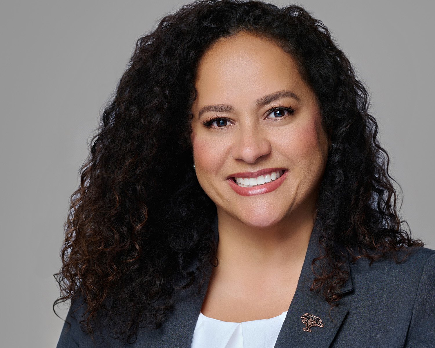
Why does my skin color look off in photos?
Have you ever looked at a photo of yourself and thought, "That doesn't quite look like me"? Not the angle, not the expression, but something subtler. The color of your skin just feels... off.
You're not imagining it. Skin tone accuracy is one of the most overlooked, and most important, elements of professional photography. And it's something I think about deeply with every single session I shoot.
Why skin tone accuracy matters:
Your headshot is often the first impression you make. Whether it's on LinkedIn, your website, or a speaking bio, people are forming opinions about you before they ever meet you. When your skin tone looks washed out, overly warm, or strangely cool, something feels "off" to the viewer even if they can't name why.
Inaccurate color can:
Make you look tired or unwell when you're vibrant and energetic
Strip away the richness and depth of deeper skin tones
Create a disconnect between your photo and your real presence
Undermine the trust and authenticity you're working so hard to build
How to spot it yourself:
You don't need to be a photographer to notice when something's wrong. Here are a few things to look for:
Ashiness or gray undertones: Skin looks flat, lifeless, or desaturated
Overly orange or red tones: Common with improper white balance in warm lighting
Blown-out highlights: Detail disappears from lighter skin areas, losing texture
Loss of depth in darker skin: Rich melanin tones appear muddy or underexposed
Mismatched face and neck: A telltale sign of heavy-handed retouching
What good skin tone rendering looks like:
Great color accuracy means your skin looks like you, on your best day. Warm where you're warm. Rich where you're rich. The goal is never to flatten or "fix" your skin, it's to reveal it beautifully and honestly.
This is why I invest in calibrated lighting equipment, shoot tethered to a color-accurate monitor, and retouch with intention rather than habit. Every skin tone is unique. My job is to make sure it looks like the real you.